Conversions are like immortality to Lord Voldemort or the Horcruxes to Harry Potter. They are sought after. It’s what every online marketing strategy aims to achieve. Traffic is all well and good, but when it comes to a Dumbledore worthy strategy it’s all about increasing conversions. So here are our tips on how to increase landing page conversions for both SEO and SEM.
Test the colours

Colour is actually incredibly important, so don’t underestimate the power of manipulating the colour of your landing page (and CTA) to increase conversions! Now let me explain, everyone did this with Neville Longbottom, and he turned out to bad ass! The study of consumer behaviour delves into how colour, and the manipulation of colour can affect the behaviour of a person. Take blue for instance, it is well known for its ability to induce calmness, whilst orange is aggressive and is effective for creating a call to action. SurveyCrest has a great post about the facts about colour psychology if you want to learn more.
So now that you know how important colour is you will need to know how to harness its incredible power… like a wand. (If I could give you a wand I would, but Ollivanders is in Diagon Alley, and not in Australia, plus they don’t have an online store!) Anyway, let’s start with the colour of the call to action, as well as other elements of the page. What is the colour scheme you are using? Create two versions of the same landing page, however manipulate the colour of one, and use A|B testing to determine the best performing page. I think you’d be surprised by the results!
Test the call to action
The call to action is one of the most important elements of a landing page, and you’ll want to ensure that it’s optimised. There are some great conversion rate optimisation tools that will assist you in determining the ideal call to action for your site such as the CrazyEgg heat map tool and Visual Website Optimiser. Some of the important elements of a call to action to experiment with include:
- Placement
- Colour
- Size
- Words (what it explicitly states)
To test your CTA start by creating slight manipulations of the placement, colour, size and words for the purpose of A|B testing or a CRO experiment. The CTA is essentially what the user will click when they are ready to convert, so if you want to increase those SEO and SEM conversions, you’ll need an optimised CTA!
Did you know…. It has been identified that time sensitive CTA’s are more likely to encourage a user to take a desired action quickly. Perhaps integrating a time sensitive CTA with your landing pages could get you the increase in conversions you’re after. Magic!
It’s all about where people are clicking
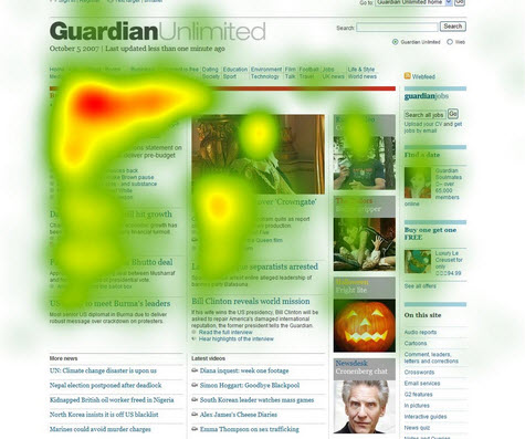
Voldemort underestimated the power of love, and digital marketers have underestimated the power of identifying where users click on a landing page. Do you know where your users are clicking? Well do ya punk? If you answered yes well done! If you answered no, then you may want to read on!
I ask you, how can you increase conversions on your landing pages if you don’t know where your users are clicking? Identifying where users click on your current landing pages will assist you in decluttering those pages to ensure they are straight to the point. You don’t want your users getting distracted! So start by creating heat map experiments on your current landing pages to identify where your users click. You can then identify problem areas, areas for improvement, and what should be removed entirely from your landing pages! This actually brings us to our next point…
Declutter your landing pages for laser beam focus
To increase conversions on your SEO and SEM landing pages you will need to ensure they are focused. Laser beam focused would be preferable. Similar to the focus Harry potter needed during his occlumency lessons.

As I mentioned above, understanding where your users are clicking, will help to declutter your landing pages to ensure that what is presented to the user is straight to the point. It entices the user to click, and complete a desirable action. So what does an ideal landing page contain?
- A headline/ title
- Supporting content such as videos or images
- Supporting elements such as customer testimonials or industry awards etc.
- A description outlining the offer
- Clear and concise call to action
- A form for the user to complete (if required)
- That benefits and value have been articulated (what is the user getting if they convert?)
- It is optimised for SEO
- Limited navigation
HubSpot covers this in a great blog post called 9 must haves for the perfect landing page. Read it if you get a chance!
Optimise your landing pages for SEO
As with any page on your site, a landing page should be optimised for SEO. That means that all on-page elements need to be optimised. This will ensure that when a user is searching and is ready to convert, that you are found right when they need you! Aka “help is always given at Hogwarts to those who ask for it”. So what elements of your landing page should be optimised?
- The message in the SERP’s (meta title & meta description) should be consistent with the landing page. It’s called message match. Moz explains this in their guide to landing page optimisation.
- The H1 tag
- Search friendly URL
- The content on the landing page
- The page should target 2-3 important keywords
- Keep the benefits/ value description short and to the point. 250 words is recommenced.
So get your little SEO wizard hat on, and get optimising your landing pages! It’s important!
Focus on the benefits

It’s kind of like when death meets the three Peverall brothers. He offers them each a prize for conquering death thus the Deathly Hallows were born. You want to ensure that all of the benefits and the value of your offer is clearly communicated to the user. Create a list of benefits or the problems your product/ service solves. Also focus on the value you are providing the user. Think of it as Voldemort and his Horcruxes, he wouldn’t have hidden his soul in a Horcrux if he didn’t think it would make him immortal. So make it clear for the user! Aim to list 3-4 main benefits on your landing page. This will assist the user in understanding exactly what they’re getting, whilst also increasing the likelihood of them converting. Yay!
Mobile friendliness applies
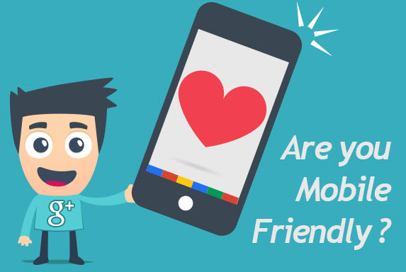
So you thought Mobilegeddon wasn’t going to apply to your landing pages? Think again! Didn’t you know that 1/3rd of internet traffic comes from mobile devices? You need to ensure that your landing pages are responsive to any user on any device. With more and more consumers searching on the go, you can’t afford not to have mobile-friendly landing pages! Mobile-friendliness also ties into user experience. By creating responsive landing pages you ensure that your users receive consistent experiences across all of their devices.
Did you know… that Google has started to devalue sites in Google Search results that do not have mobile friendly sites. So if your landing pages are not mobile friendly they could potentially be devalued. If you want to increase landing page conversions you’ll need to make all of you landing pages mobile friendly.
We hope our little guide filled with an abundance of Harry Potter references has educated you on how to increase SEO and SEM landing page conversions. Remember, if you ever need any help you can ask the wizards at AMIRE! We’re always happy to help you! As always, mischief managed peeps!